by Chris Nicholson
@ShootingTennis
I’ve been covering the US Open as a writer and photographer for two decades—this is, exactly, the 20th year I’ve worked from here. In that time, as any tennis fan knows, the grounds have changed considerably. And in this current time—this period of a few years—changes big and small are rippling across the grounds in the form of new courts, new stadiums and, pertinently, the things that go over them.
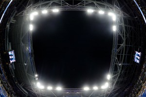
The biggest prevailing ripple is apparent even from off the grounds, from the soccer fields of Flushing Meadows park, from all lanes of the Grand Central Parkway, and especially from any seat in Arthur Ashe Stadium. This ripple was caused by rain—too much rain causing too many postponements over too many recent years. Sit in Ashe now, look up, and you see the conspicuous presence of the skeletal roof “superstructure” atop the largest tennis stage in the world.
Really, though, you don’t even need to look up to see the roof. From any angle of view, it’s there. It’s apparent. It is always seen, anywhere you look, even in your peripheral vision as you oscillate your gaze of tennis balls bouncing to and fro.
At the beginning of the tournament, the roof structure was the dominant source for conversation, among fans and the media. Particularly for those who had come before, and particularly for those who had been coming for many years, this new cage around our beloved stadium was fascinating. Sitting beneath it, you sense a perceptive dissonance—you feel like you’re inside, in an enclosed arena, though intuitively you know you’re not. This optical illusion is created by always seeing roof unless you look straight up, which of course you never do, unless your intent is to see no roof.
Some have liked the new look, some have not. I’ve held both opinions. I couldn’t decide if it was good or bad. I could describe it to myself only as “interesting”—which, in a final assessment, I decided can be only good, because change is not always positive, but interesting always is.
Altering the stadium to this magnitude affects everyone, from players to fans to media members (in order of the importance of their opinion). Aside from the aesthetic component, this new architecture affects other senses, as well. Remember the late-summer winds that would sometimes swirl into the stadium, tornado’ing napkins, and fluttering tossed tennis balls? They’re gone. The roof structure has eliminated the wind entirely.
But that same obstacle that keeps the wind out, keeps the noise in. What used to be nearly silent murmurs of the crowd has become an ever-present hum, like a giant bee’s nest. Also mixed in are the rumbles and screeches of passing 7 trains, which I do not recall having ever heard in previous years, but which somehow filter through the roof beams and thunder onto the court.
All of those sorts of things interest me as a longtime US Open fan, but they interest me in another way, too: as a US Open photographer. Any change to the USTA Billie Jean King National Tennis Center has the potential to alter the photography produced in this environment.
The most prominent example I can think of during my two decades here (aside from the obvious, i.e. the opening of Arthur Ashe Stadium in 1998) happened about 15 years ago, when the photographer’s pit on the west side of the stadium was eliminated and replaced with a second row of pit seats on the east side. The result was that, from the photographers’ perspective, players were back-lit almost all day. Look at the best US Open photos from the late 1990s, and you’ll notice how vivid the colors were. That’s not because film was more colorful than digital, it’s because that old west-side pit allowed us to photograph the players in the direct, warm-toned light of late afternoon.
Other changes over the years have also affected the photography:
• The extra center linesperson added during the first week of play, and to the return-side of the court, made it nearly impossible to photograph a player with an unobstructed US Open logo in the background.
• TV cameras placed in the court corners make an already busy background even busier. (Lest you think backgrounds are unimportant to a photograph, here’s a tip: An organized and/or clean background is almost always the difference between a great photo and one destined for the trash.)
• Adding sponsor logos to the net reduced the number of angles from which you can photograph a player hitting a volley.
• After this year, the Grandstand is being demolished, thereby eliminating the only place at the US Open where a photographer can shoot straight down on the players, which is excellent for artistic use of shadows in harsh sunlight.
Those are all negative examples—things that detract from the quality of the photography. Positive examples abound, too.
• The addition of the Court 17 stadium provided opportunities for making photos unlike anywhere else at the US Open. The quarry-tile walls in the corners of the court make for a great background unseen elsewhere at the Open. And from the southeast corner of the stands, you can photograph the court with Ashe Stadium rising up behind.
• Last year, the new Courts 4 through 6 allowed late-day light to juxtapose with deep shadows on the back-screen, creating a mixed lighting effect previously found on only two courts.
• The tall bleachers aside the old Courts 6 and 8 used to block sunlight early in the evening; since tearing them down two years ago, the best light of the day now hits some of the side courts for an 20 extra minutes.
These are the kinds of things photographers pay attention to, because they directly impact the images we can create.
So how does the new roof superstructure affect photography?
Remember that glorious light that was minimized when the west photo pit was eliminated? Now we don’t see that light at all, from any angle inside the stadium. By the time the sun is low enough in the sky for that quality of light to exist, the court is completely in the shadow of the roof.

Today, if you want to photograph a top player in great light, it won’t happen in Ashe; you have to hope he or she plays on the Armstrong court. (But even that won’t be possible after this year, as the replacement court for Armstrong will also have a roof structure. So all those nicely lit photos of top players? You will be able to view them at the International Tennis Hall of Fame, as the museum relics they will soon be.)
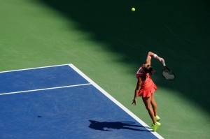
Again, though, there are positives, and they’re found in two related words: shade and shadow. As grand as the light in Ashe was in late afternoon, it was generally terrible before then. Midday sun shining unimpeded into the bowl of the stadium created a uniform, unsightly contrast to the whole scene. The players often looked bad—especially if wearing a hat or visor casting a shadow on the face—and were hard to visually differentiate from the busy background of the brightly lit, light-shirted crowd. Photographers have some tools in the proverbial box for improving bad backgrounds, and we needed all of them to make early-afternoon Ashe look … well, not “good,” but just “not terrible.”
Now, that problem is resolved. The covers on the south and west sides of the roof structure provide shade during midday, which diffuses the normally harsh light into something useful—not as strong, but certainly more even.
Before mid-afternoon, the effect is even better. Matches usually start at 11 a.m., and from then until 2:45 p.m. those same roof covers cast a deep shadow that recedes from baseline to baseline, then turn a corner and shift from sideline to sideline. Those shadows not only obscure those aforementioned busy backgrounds, but also create creative opportunities to photograph players moving into and out of the light. (A similar phenomenon used to happen in the better light at the end of the afternoon, but for only 30 minutes.)

So yes, we’ve lost some excellent photography conditions, but we’ve gained some others. For those photographers who have been making tennis images here for two, three, four decades, the new light scenarios bring new life to our creative endeavors. We’re here for business, but at the foundation we’re all artists. And for any artist, “new” should always be a catalyst to improve. Constant growth is good.
Of course, the US Open is not done changing. More alterations are coming in the next couple of years, and I’ll be eager to see how they affect not only the photography, but the tennis show, too. As long as the changes are interesting, they’re good. And no one has ever accused the US Open of not being interesting.
###
Chris Nicholson is a writer and photographer based in New York City. A former editor for Tennis magazine and the author of the book Photographing Tennis, he has been covering the sport for over 20 years. www.PhotographingTennis.com
